Flex
Flex
요소들을 유연하게 배치시켜주는 레이아웃 속성
flex-direction
컨테이너의 주축을 설정하는 속성
<!DOCTYPE html>
<html>
  <head>
    <meta charset="utf-8" />
    <link rel="stylesheet" href="index.css" />
  </head>
  <body>
    <div>
      <div class="container">
        <div class="item" style="background-color: red;"></div>
        <div class="item" style="background-color: orange;"></div>
        <div class="item" style="background-color: yellow;"></div>
        <div class="item" style="background-color: green;"></div>
        <div class="item" style="background-color: blue;"></div>
        <div class="item" style="background-color: indigo;"></div>
        <div class="item" style="background-color: purple;"></div>
      </div>
    </div>
  </body>
  <script src="index.js"></script>
</html>
.container {
display: flex;
border: 1px solid black;
}
.item {
width: 100px;
height: 100px;
}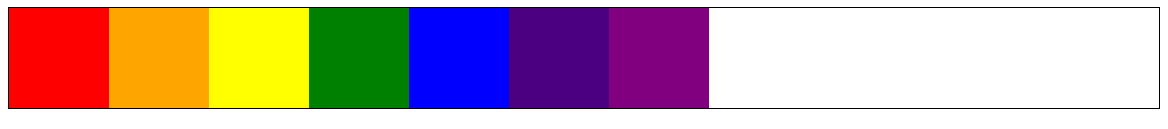
1. flex의 기본 flex-direction 값은 가로 row 이다.
.container {
  display: flex;
  flex-direction: column;
  border: 1px solid black;
}

.item {
  width: 100px;
  height: 100px;
}
1. flex-direction : column은 Flex 아이템의 정렬 방향을 세로로 한다
justify-content
컨테이너의 main-axis를 기준으로 content 박스를 정렬시키는 속성
.container {
  display: flex;
  flex-direction: row;
  /*
  justify-content: start //default
  justify-content: center;
  justify-content: end;
  justify-content: space-between;
  justify-content: space-around;
  justify-content: space-evenly;
  */
  border: 1px solid black
}

.item {
  width: 100px;
  height: 100px;
}


space 접두사

flex-shrink
Flex 아이템이 Flex 컨테이너의 크기보다 작은 경우, 얼마나 줄어들지 결정하는 속성
.container {
  display: flex;
  flex-direction: row;
  border: 1px solid black;
}

.item {
  width: 100px;
  height: 100px;
}
1. 기본값은 1이며, 0 이상의 값이 올 수 있다
2. flex-shrink의 값이 1(기본값)일 때, Flex 아이템의 크기를 px로 고정해도 컨테이너에 맞춰 줄어든다
.container {
  display: flex;
  border: 1px solid black;
}

.item {
  width: 100px;
  height: 100px;
  flex-shrink: 0;
}
3. flex-shrink의 값이 0일 때, Flex 아이템의 크기는 컨테이너에 맞춰 줄어들지 않고, 컨테이너를 뚫고 나온다
align-item
content 박스 내부에서 cross-axis를 기준으로 Flex 아이템을 정렬시키는 속성
.container {
  display: flex;
  /*
  align-items: strech; //default
  align-items: start;
  align-items: center;
  align-items: end;
  */
  height: 400px;
  border: 1px solid black;
}

.item {
  width: 100px;
  height: 100px;
}


gap
Flex 아이템간의 간격을 지정하는 속성
.container {
  display: flex;
  flex-direction: row;
  gap: 20px;
  border: 1px solid black;
}

.item {
  width: 100px;
  height: 100px;
}
1. gap 속성은 Flex 아이템들의 간격만을 정해주고, 부모요소와의 간격에는 영향을 주지 않는다.
flex-wrap
.container {
  display: flex;
  flex-direction: row;
  flex-wrap: wrap;
  gap: 20px;
  border: 1px solid black;
}

.item {
  width: 100px;
  height: 100px;
}
1. flrx-wrap의 wrap속성값은 flex-shrink 속성에 상관없이 Flex 아이템의 크기를 유지한 상태로 줄바꿈을 해준다