
transition : 속성의 변화가 일어날 때, 변화 방법을 정의
.box {
  border-radius: 20px;
  background-color: brown;
  width: 200px;
  height: 200px;
  transition: transform 0.5s ease;
}
1. transform : 변화가 일어날 속성
2. 0.5s : 변화가 일어나는 시간
3. ease : 변화가 일어나는 속도 (ease, linear, ease-in, ease-out, ease-in-out)
.box {
  border-radius: 20px;
  background-color: brown;
  width: 200px;
  height: 200px;
  transition: box-shadow 0.3s ease, transform 0.3s ease;
}

.box:hover {
  transform: translateY(-20px);
  box-shadow: 10px 10px 20px rgba(0, 0, 0, 0.5);
}
transition 속성 값을 2개 이상 사용할 수 있다.
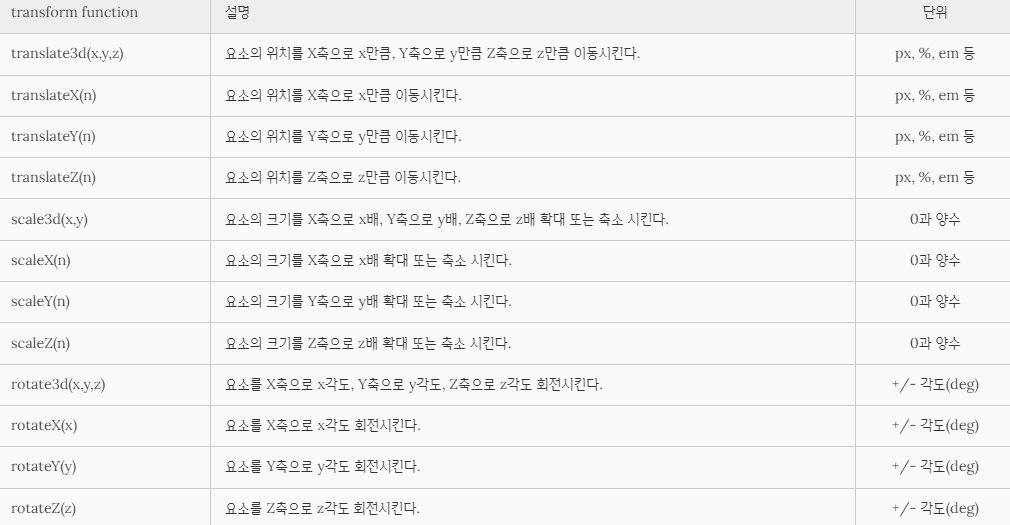
transform : 요소를 회전, 크기 조절, 이동 시키는 속성

.box {
  border-radius: 20px;
  background-color: brown;
  width: 200px;
  height: 200px;
  transition: transform 0.5s ease;
}

.box:hover {
  transform: translateX(100px);
}
translateX(100px) : x축으로 100픽셀 이동시킨다
그 외, 다른 transform 속성 값
animation
더욱 정밀한 애니메이션 효과를 위한 속성

.text {
  font-size: 30px;
  position: absolute;
  animation: sideIn 2s ease forwards;
}

@keyframes sideIn {
  0% {
    left: 0px;
    opacity: 0;
  }
  100% {
    left: 70px;
    opacity: 1;
  }
}animation-delay
애니메이션을 언제 시작할지 설정
animation-delay: 250ms;
animation-delay: 2s;
animation-delay: -2s;
animation-direction
애니메이션의 움직임 방향을 설정
/* Single animation */
animation-direction: normal;
animation-direction: reverse;
animation-direction: alternate;
animation-direction: alternate-reverse;

/* Multiple animations */
animation-direction: normal, reverse;
animation-direction: alternate, reverse, normal;

/* Global values */
animation-direction: inherit;
animation-direction: initial;
animation-direction: unset;
1. normal(default): 매 사이클마다 정방향으로 재생,순환할 때 마다 애니메이션이 시작 상태로 재설정되고 다시 시작된다
2. reverse: 애니메이션을 매 사이클마다 역방향으로 재생시킨다. 순환 할 때 마다 애니메이션이 종료 상태로 재설정되고 애니메이션 단계가 거꾸로 수행되고 타이밍 기능 또한 반대로 된다 (ex: ease-in -> ease-out)
3. alternate: 매 사이클마다 각 주기의 방향을 뒤집으며, 첫 번쨰 반복은 정방향으로 진행된다. 사이클이 짝수인지 홀수인지를 결정하는 카운트가 하나에서 시작된다
4. alternate-reverse: 매 사이클마다 각 주기의 방향을 뒤집으며, 첫 번째 반복은 역방향으로 진행된다. 사이클이 짝수인지 홀수인지를 결정하는 카운트가 하나에서 시작된
animation-duration
애니메이션 움직임 시간을 설정
/* Single animation */
animation-duration: 6s;
animation-duration: 120ms;

/* Multiple animations */
animation-duration: 1.64s, 15.22s;
animation-duration: 10s, 35s, 230ms;
1. 애니메이션이 한 사이클을 완료하는 데 걸리는 시간
2. s, ms로 지정할 수 있고 기본값은 0으로, 설정값은 0, 또는 양수여야 한다
animation-fill-mode
애니메이션이 끝난 후의 상태를 설정
/* Single animation */
animation-fill-mode: none;
animation-fill-mode: forwards;
animation-fill-mode: backwards;
animation-fill-mode: both;

/* Multiple animations */
animation-fill-mode: none, backwards;
animation-fill-mode: both, forwards, none;
1. none(default): 애니메이션이 끝난 후의 상태를 설정하지 않는다
2. forwards: 애니메이션이 끝난 후, 그 지점에 그대로 있는다
3. backwards: 애니메이션이 끝난 후 시작점으로 돌아온다
4. both: 애니메이션의 앞 뒤 결과를 조합하여 설정한다
5. inherit: 애니메이션의 상태를 상위 요소한테 상속받는다
animation-iteration-count
애니메이션의 반복 횟수를 설정
/* Keyword value */
animation-iteration-count: infinite;

/* <number> values */
animation-iteration-count: 3;
animation-iteration-count: 2.4;

/* Multiple values */
animation-iteration-count: 2, 0, infinite;

/* Global values */
animation-iteration-count: inherit;
animation-iteration-count: initial;
animation-iteration-count: revert;
animation-iteration-count: revert-layer;
animation-iteration-count: unset;
1. number: 애니메이션의 반복 횟수를 설정 한다
2. infinite: 애니메이션 반복 횟수를 무한으로 설정 한다
3. inherit: 애니메이션 속성을 상속받는다
animation-name
애니메이션에 적용할 @keyframe을설정
/* Single animation */
animation-name: none;
animation-name: test_05;
animation-name: -specific;
animation-name: sliding-vertically;

/* Multiple animations */
animation-name: test1, animation4;
animation-name:
  none,
  -moz-specific,
  sliding;

/* Global values */
animation-name: inherit;
animation-name: initial;
animation-name: revert;
animation-name: revert-layer;
animation-name: unset;
1. @keyframes 이름
2. none: 애니메이션 움직임을 적용하지 않는다
3. inherit: 애니메이션 속성을 상속받는다
animation-play-state
애니메이션의 진행상태를 설정
/* Single animation */
animation-play-state: running;
animation-play-state: paused;

/* Multiple animations */
animation-play-state: paused, running, running;

/* Global values */
animation-play-state: inherit;
animation-play-state: initial;
animation-play-state: revert;
animation-play-state: revert-layer;
animation-play-state: unset;
1. running: 애니메이션을 실행
2. paused: 애니메이션을 일시 중지
3. initial: 속성값을 기본으로 초기화
4. rever: 애니메이션을 처음 시작 상태로 돌려보낸다
5. revert-layer: 요소가 지나치게 깜빡거리거나 누락되었을 때 눈에 띄게 하는 방법으로 요소의 애니메이션 상태를 재설정 한다
6. unset: 속성값을 초기화 한다
7. inherit: 애니메이션 속성을 상속받는다
anumation-timing-function
애니메이션 움직임의 속도를 설정
/* @keyframes duration | easing-function | delay |
iteration-count | direction | fill-mode | play-state | name */
animation: 3s ease-in 1s 2 reverse both paused slidein;

/* @keyframes duration | easing-function | delay | name */
animation: 3s linear 1s slidein;

/* 애니메이션 두 개 */
animation:
  3s linear slidein,
  3s ease-out 5s slideout;
1. liner: 처음 속도와 마지막 속도를 일정하게 한다
2. ease: 처음엔 천천히 시작하여 빨라지고 마지막에 느려진다
3. ease-in: 천천히 시작되어 정상 속도가 된다
4. ease-out: 마지막에 천천히 속도를 줄인다
5. ease-in-out: 천천히 시작되어 정상 속도가 되었다가 마지막에 느려진다
6. step-start: 애니메이션을 시작점에서만 표현
7. steps(int, startlend): 애니메이션을 단계별로 설정한다
8. cublic-bezier(n, n, n, n): 베지어 곡선값을 만들어서 속도를 설정한다
9. inherit: 애니메이션 속성을 상속받는다
@keyframes
애니메이션 과정을 제어
@keyframes sideIn {
  0% {
    left: 0px;
    opacity: 0;
  }
  100% {
    left: 70px;
    opacity: 1;
  }
}
1. 백분율 대신 from(시작 offset), to(마지막 offset) 로 사용할 수 있지만, 백분율이 애니메이션 과정을 더 세밀하게 제어할 수 있다
'CSS' 카테고리의 다른 글
| Grid (0) | 2024.04.14 |
|---|---|
| box-shadow (0) | 2024.04.08 |
| width (0) | 2024.02.12 |
| Flex (0) | 2024.02.11 |
| Cascading, position (0) | 2023.10.22 |